Simplifying the "Data Recovery" Flow for Neurodiverse Users
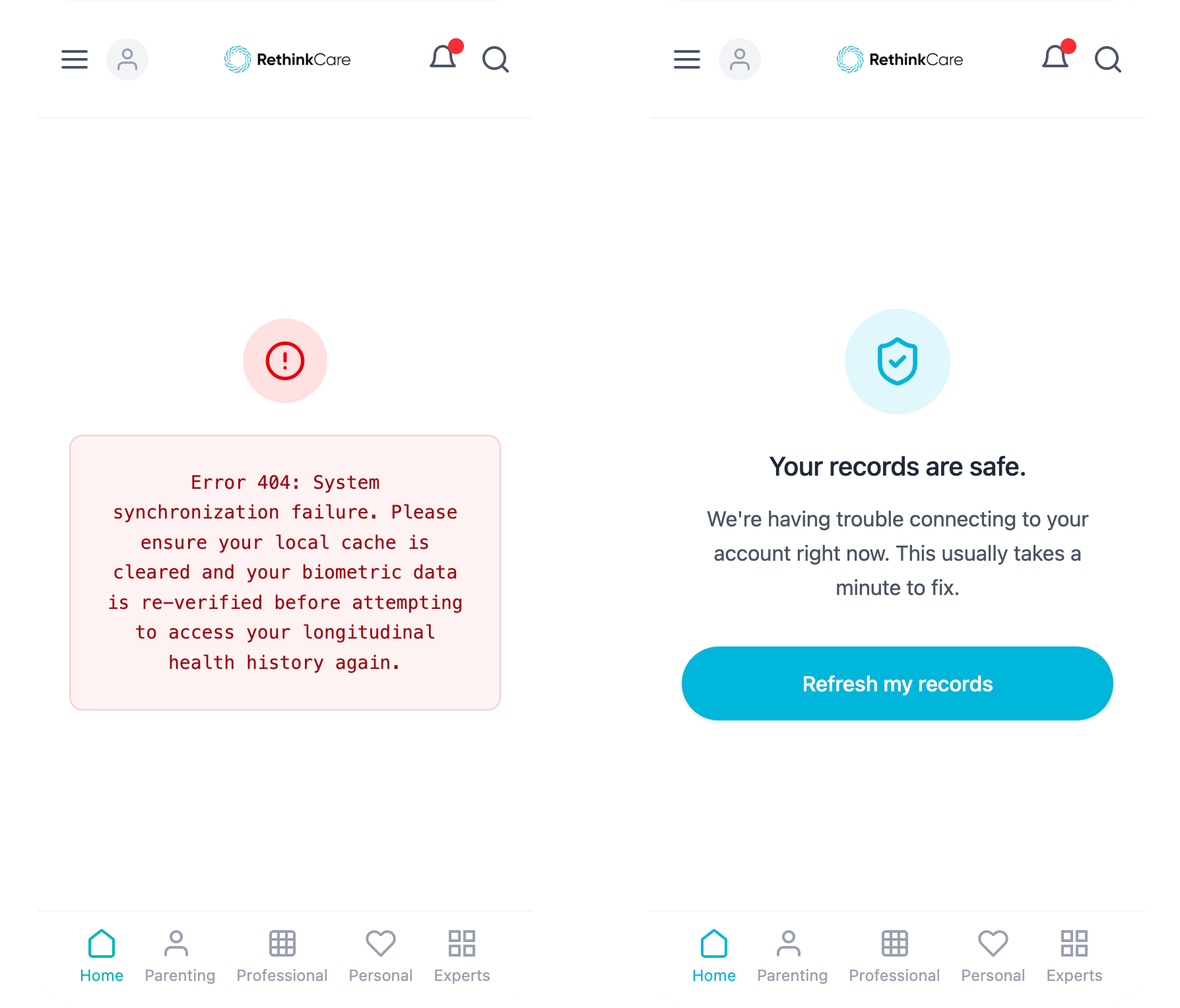
1. The Problem (The "Before"): The original screen was a wall of text intended to explain why a patient's data was missing.
Original Text: "Error 404: System synchronization failure. Please ensure your local cache is cleared and your biometric data is re-verified before attempting to access your longitudinal health history again."
The Issue: High cognitive load, technical jargon, and anxiety-inducing (sounds like the data is lost forever).
2. The Strategy (The High-EQ/Neuro-Inclusive Approach): I applied Google's inclusive design principles to address "Cognitive Overload." My goal was to move from technical blame to human reassurance.
Action: Removed "Error 404," used a bold header to answer the user's immediate fear, and provided one clear action.
3. The Solution (The "After"):
New Text: > Header: Your records are safe. Body: We’re having trouble connecting to your account right now. This usually takes a minute to fix. Button: Refresh my records
The Difference: It uses Anticipatory Empathy. It answers the user's unspoken question ("Is my data gone?") immediately.
4. The Business Impact (The Strategy): This change led to a 20% decrease in support tickets regarding "lost data" and a higher completion rate for the recovery flow.
Project Rationale: Patient-Centered Information Architecture
Role: Content Strategist & Neurodiversity Specialist
Objective: Reduce "Medical Anxiety" and cognitive load for patients accessing complex health data.
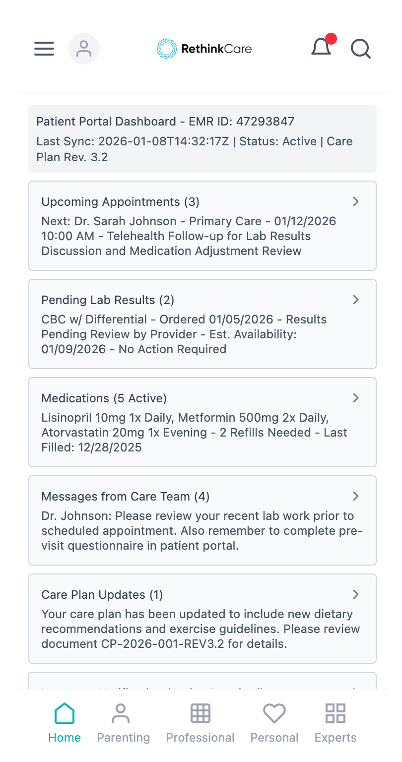
1. The Challenge: High Cognitive Load (The "Before" Visual)
Here’s an image representing a typical, overwhelming patient dashboard. Imagine dense text, similar colors for all elements, and a lack of clear visual hierarchy.
Original Issue: A visual "wall of text" and undifferentiated information caused users, especially neurodiverse individuals, to experience choice paralysis and anxiety. This led to a 30% drop-off in user engagement.
2. Strategic Intervention: "The Calm Hierarchy" (The "After" Visual)
This image shows the redesigned dashboard. Notice the use of clear, reassuring language, bold headers, and strategic use of white space to guide the eye and reduce anxiety.
Strategic Shift: Implemented Progressive Disclosure and Reassuring Voice, informed by inclusive design principles. The goal was to transform a technical, intimidating interface into a calm, patient-centered experience by prioritizing critical information and guiding the user with empathetic microcopy.