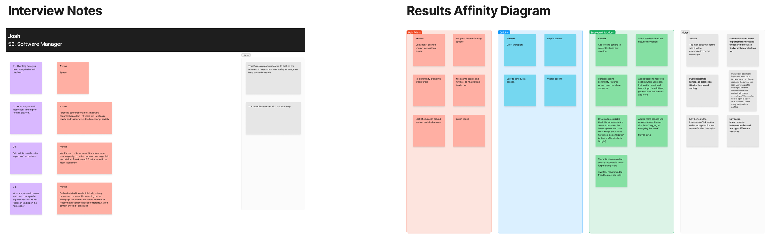


I was to gather user insights through interviews and provide deliverables in the form of personas and user journeys in order to determine how to best improve the homepage navigation of the content library.
We were looking to increase user engagement and satisfaction with their content dashboard. Adding features that would make the platform more customizable and curated to the user’s personal interests and needs.
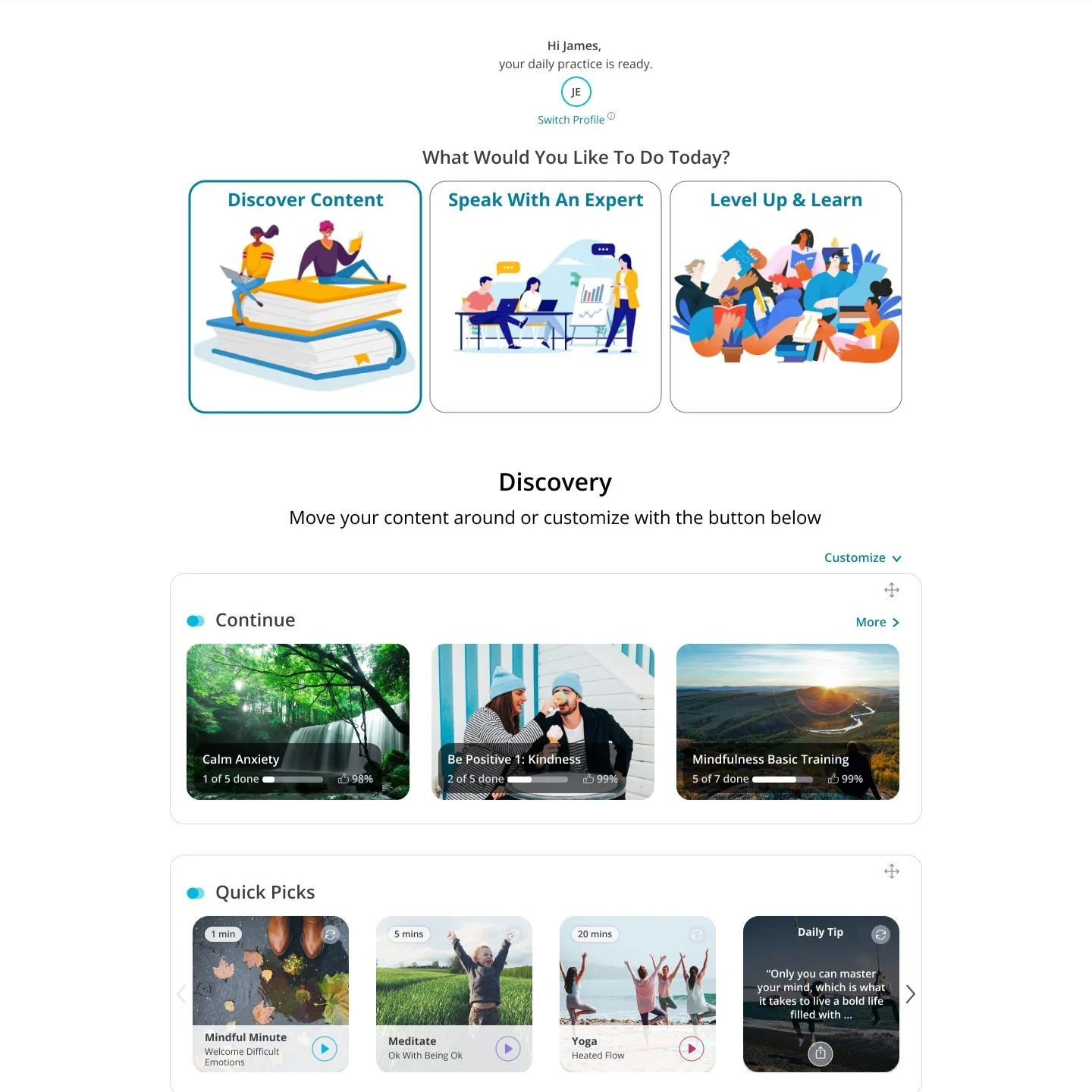
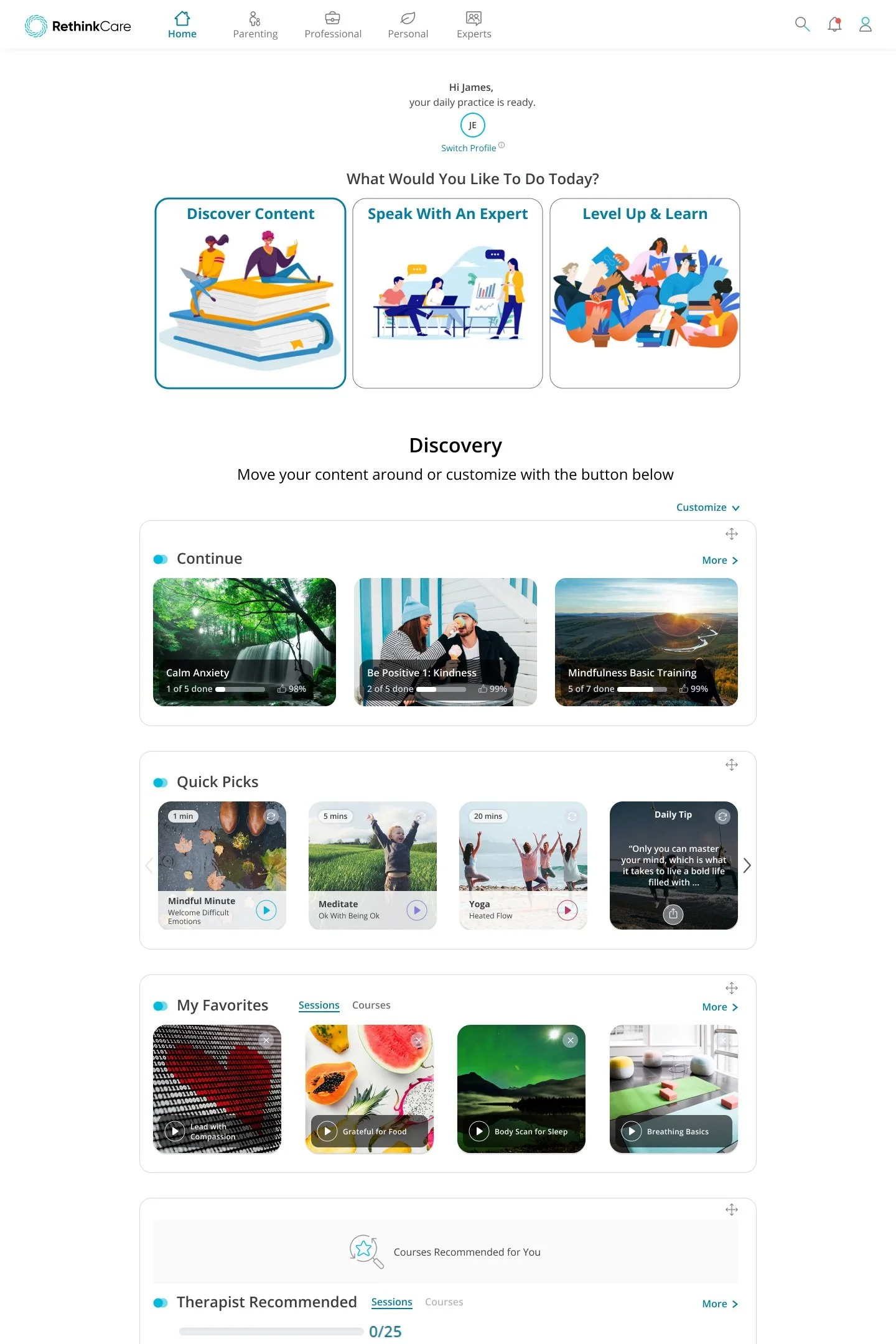
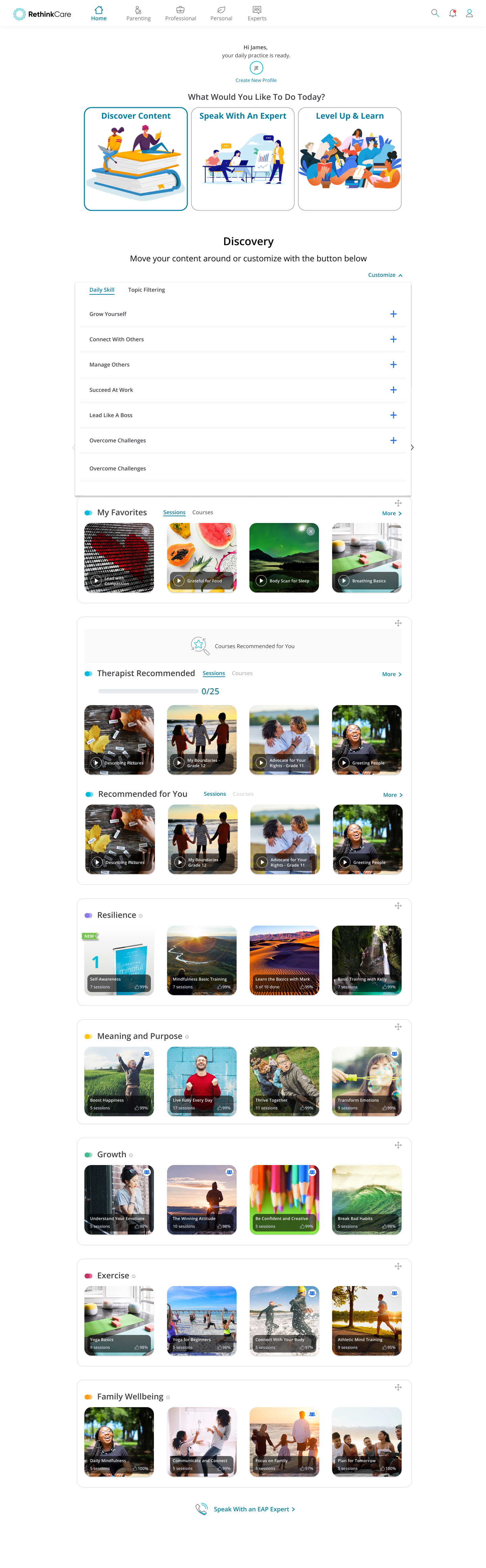
It was determined filtering was needed on the homepage to more easily find specific content the user was looking for.
In addition, having helpful top of page guidance and/or content offerings to get the user started on their journey would be helpful.
As it existed previously, upon landing on the homepage, the user felt overwhelmed by choices.
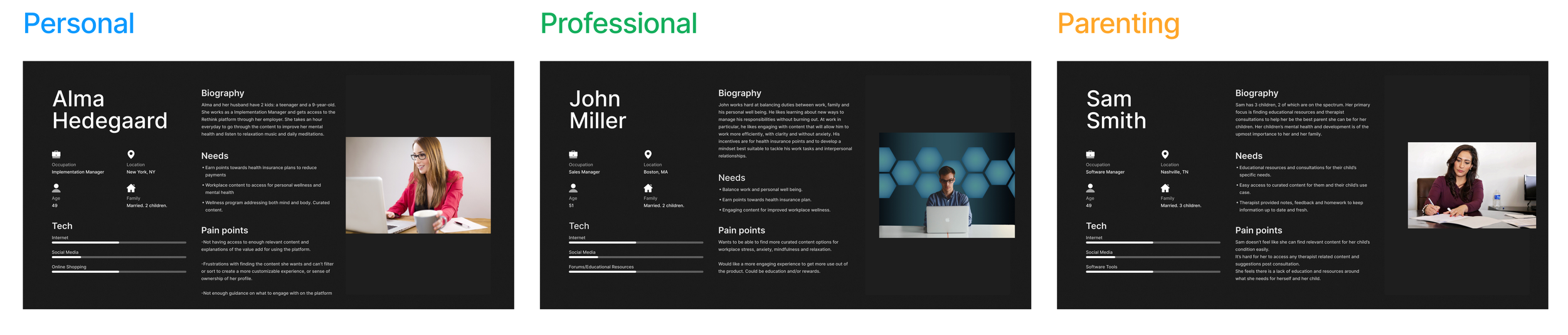
We broke out personas into the three primary users: Parenting, Personal and Professional.
It was also determined that having an icon and cta to switch between user profiles top of page would be beneficial. Users didn’t have an easy way to do so without going into accounts so we wanted to eliminate that click.
Part of this redesign was to make the onboarding screens easier to understand and more conducive to setting the user up for success upon entering the content library dashboard.
We update the copy and design of the Areas of Interest screen to give users a more clear idea of the type of content they would be seeing when entering the platform.
The design changes were the addition of the three cards at the top of the page to help guide the user, the new profile icon and cta and the drop down filter option to change the look and content structure on their dashboard.
The intention was to increase the customization, engagement and user experience of the user’s content library. Making it more personalized and with features that would allow them to interact with the content they truly want to see.
The changes were shared with users in the form of some A/B usability testing before going to development. We landed on the design you see here and 30 days after implementation, content engagement increased by 22%.
Great project with a positive outcome that actually helped the user’s get more out of the platform and content. Working with Product and the Developers was easy due to the freedom I had to implement my UX process and use the research outcomes to make smart decision decisions.
Functional feasibility and requirements was communicated with the team both before and after research was conducted. The designs took about a month to get done with low fidelity wireframes made first followed by multiple iterations and then into high fidelity. Usability testing took another week or so.
From the start of the project, which included discovery and research, to completion I would say this took a total of about 2 months. 30 days of KPI monitoring took place after implementation to determine the user engagement increase.
Overall, a great project to be a part of!