


Virtual Health Partners Project Scope
Background
Virtual Health Partners or VHP, is a health and wellness startup based out of NYC.
The company focuses on providing weight loss, fitness and lifestyle modification via a virtual platform that can be accessed from anywhere. There is also live consultations and appointments set up with Dietitians to help provide one on one feedback and guidance. Customers sign up for the program either through referrals from VHP partnered physicians or via the website/app.
My Role
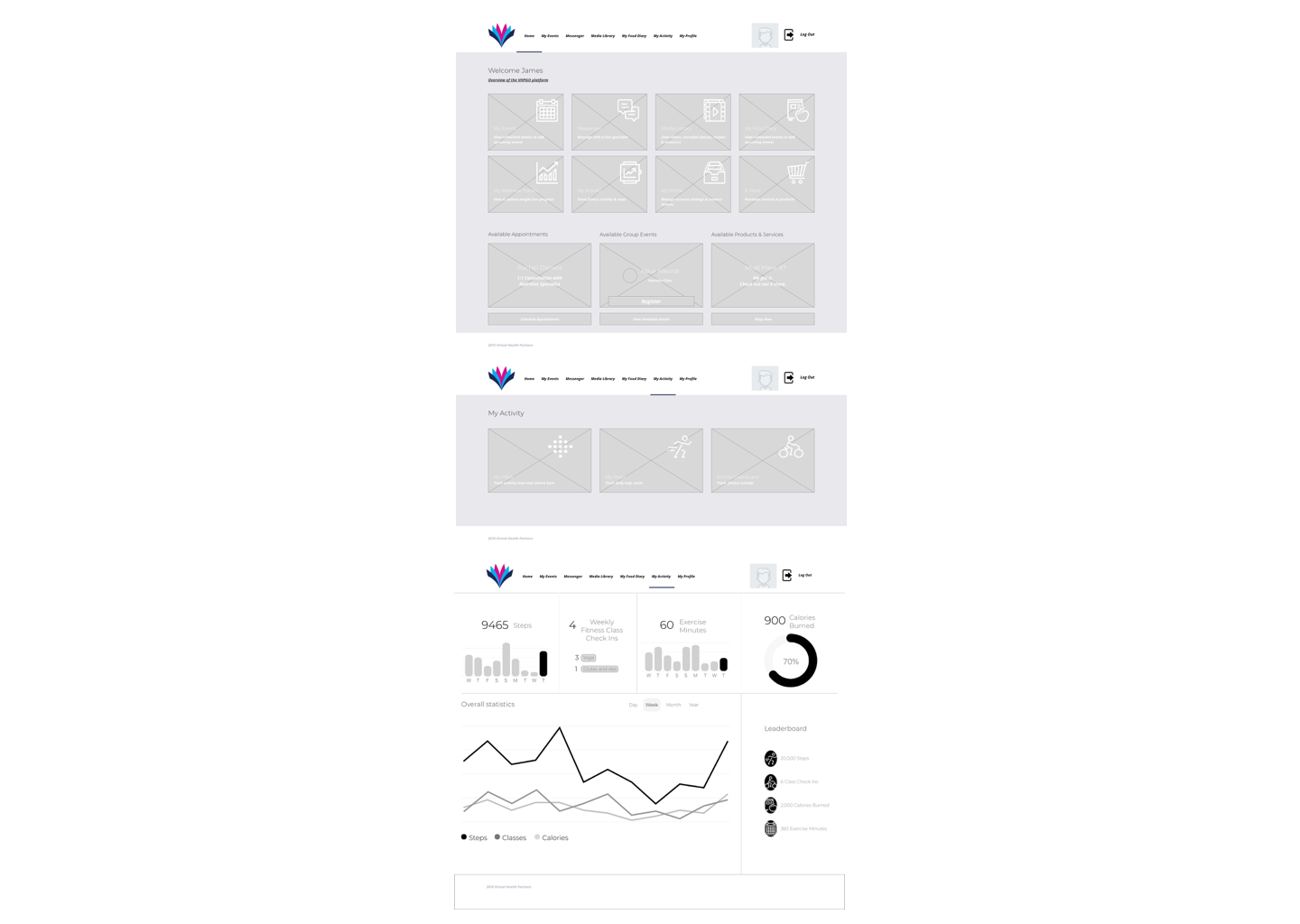
As the company grows there is a need for more interconnectivity and community between members on the platform. An Activity Dashboard for the members is needed so that they can track their progress along with others on the platform.
The Problem
To increase engagement and community by creating a dashboard feature that will track user activity data and incorporate an anonymous user leaderboard to help create and motivate the VHP community.
Research
Activity trackers and fitness apps with community dashboards have exploded on the scene over the last 5 years. Mainly, due to the popular rise of wearables that can track your activity in real time. This creates a sense of obligation and motivation to stay active in reaching your goals when everything can be tracked and monitored.
The social element of this further increases the drive of users to keep up with fellow users as dashboards record stats. The key is creating a welcoming competitive environment rather than a intimidating platform for only experienced fitness enthusiasts.
Virtual Health Partners has a member base that is primarily looking to lose weight and are beginners in attending fitness classes and changing their lifestyle.
Creating a supportive community in which motivation and encouragement is the focus seems to be of the upmost importance.
Methodologies
Did a market and competitor analysis of current fitness apps utilizing activity dashboard. After that step, I conducted my interviews with current platform users.
Analysis
Both my user interviews and competitive research allowed me to properly narrow down the user persona that would be utilizing the features of an activity dashboard.
The most important takeaways were that those individuals struggling to lose weight or reach a particular fitness goal had obstacles in their lives that made accomplishing their goals seem impossible.
Another key point was that some activity tracking apps can feel intimidating and daunting to even start. Sometimes catering to a person already well into their fitness journey or of a more advanced level.
A supportive community with the aid of technology to help track progress and motivate further achievement was ultimately what everyone was looking for.

Prototyping
The Invision prototype was to test the workflow from the VHP homepage to the new activity dashboard feature.
The goal here was to receive feedback on the task flow, hierarchy, and wireframe design work.
Particularly, if the activity dashboard made sense and included all the essential components to achieve the desired outcomes for the user.
This was reviewed and tested internally with the VHP team at this stage in the proccess.
Usability Testing
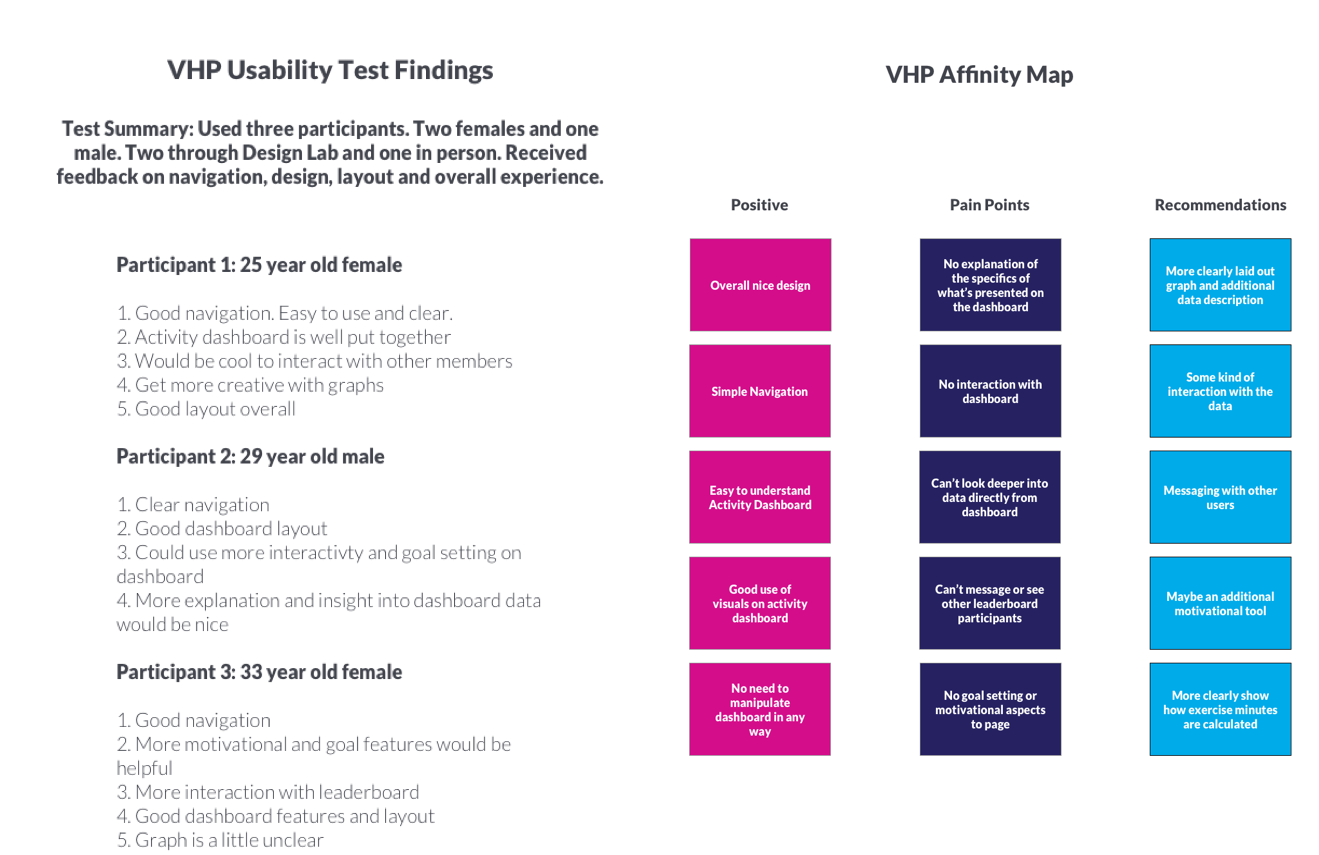
Had six participants test the prototype and received some interesting results that helped me iterate on the wireframes and properly take next steps in the UI process.
The primary KPI we measured was the Task Success Rate, which gave us a percent based:
Number of correctly completed tasks/Total Number of attempts
We looked at the navigation from the homepage to the activity dashboard, while inputting some tracking information and even locating where to link a fitness wearable. We ended up having a 90% completion rate.
Also, a System Usability Scale was conducted after the testing, which is essentially just a standard survey with 10 questions ranging from Strongly disagree to Strongly agree.
Design specific feedback was also taken from 3 of the participants regarding sizing, object placement and clarification of some of the components, which although not as quantifiable. was also very important in shaping the finished product.
Design and UI
The final designs were made using the same color palette and typography as the current platform for consistency and congruency.
The activity dashboard features will need further iterations based on the feedback from the current user base.
The main focus here was responsive desktop being that the user demographic is slightly older and primarily uses desktop. A mobile version of the activity dashboard was created as well.


Further user testing was done after this point to ensure the near finished product adhered to their liking and any additional pain points can be addressed before heading into development. However, I was not part of this process due to the nature of my contract and budget allocation.
Summary
Overall, this was a great experience to work with a high growth Health and Wellness startup based out of NYC.
I learned to not put too much emphasis on assumptions of the wants and needs of the user even if there already is an established user base with correlating data. Every new feature and design process has to have the proper usability testing and research to really empathize and create the best possible product.
I would certainly put more trust in myself and everything I have learned in future projects because I see now that following the UX process is the best possible way to deliver on both the user and business needs.