


About RethinkCare: An employee wellness app focused on neurodiversity, parenting and personal wellbeing.
Business Context: Their was a need to improve the clarity of the onboarding experience and homepage so that users had a better way of discovering content that matters to them. The current experience had visual overload and not much personalization.
Team Composition: I served as the UX lead on the project and worked closely with two PM’s, several Engineers, Marketing and Stakeholders on the Operations side.
Success Criteria: The goal was to reduce onboarding friction by providing more content clarity, improve engagement by offering a more personalized homepage experience and streamline the content discovery user flow within the platform.
Early in the project, we had a lot of competing priorities coming from different parts of the business . Ops wanted onboarding to reduce support tickets, Product wanted to increase engagement, and Marketing wanted more visibility for new initiatives.
To clarify the scope, I facilitated a working session with the PMs and Ops leads where we mapped out current user pain points next to business goals. That made it clear that if we focused on clarity and guidance during the first-time experience, we could satisfy both: reduce user confusion (which reduced support tickets) and improve engagement (which supported conversion).
I proposed a phased onboarding approach, prioritizing just the essential steps to get users activated, while flagging lower-priority asks as “Phase 2.” This got buy-in from Engineering by reducing complexity, and helped Product and Marketing see how we could evolve the experience over time without overloading the user.
This alignment upfront helped us move faster with fewer revisions, because everyone was clear on what success looked like from both a user-centered and business-aligned perspective.
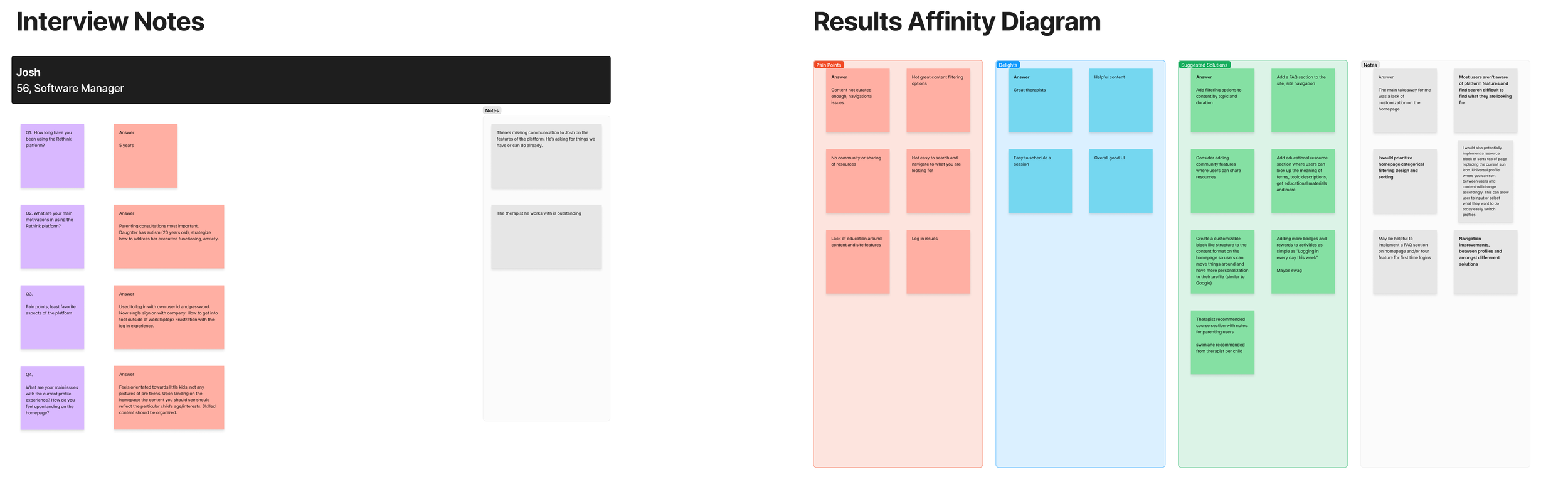
Next was to conduct research and validate our user pain point assumptions. I gathered qualitative and quantitative user insights through interviews and surveys. I provided deliverables in the form of personas, an affinity diagram and powerpoint presentation (survey results).
Our research showed that users were overwhelmed by too much content upfront and unsure of what RethinkCare actually offered.
We were looking to increase user engagement and satisfaction by better guiding the user from onboarding onto the homepage. Improving design that would make the platform more absorbable and curated to the user’s personal interests and needs.
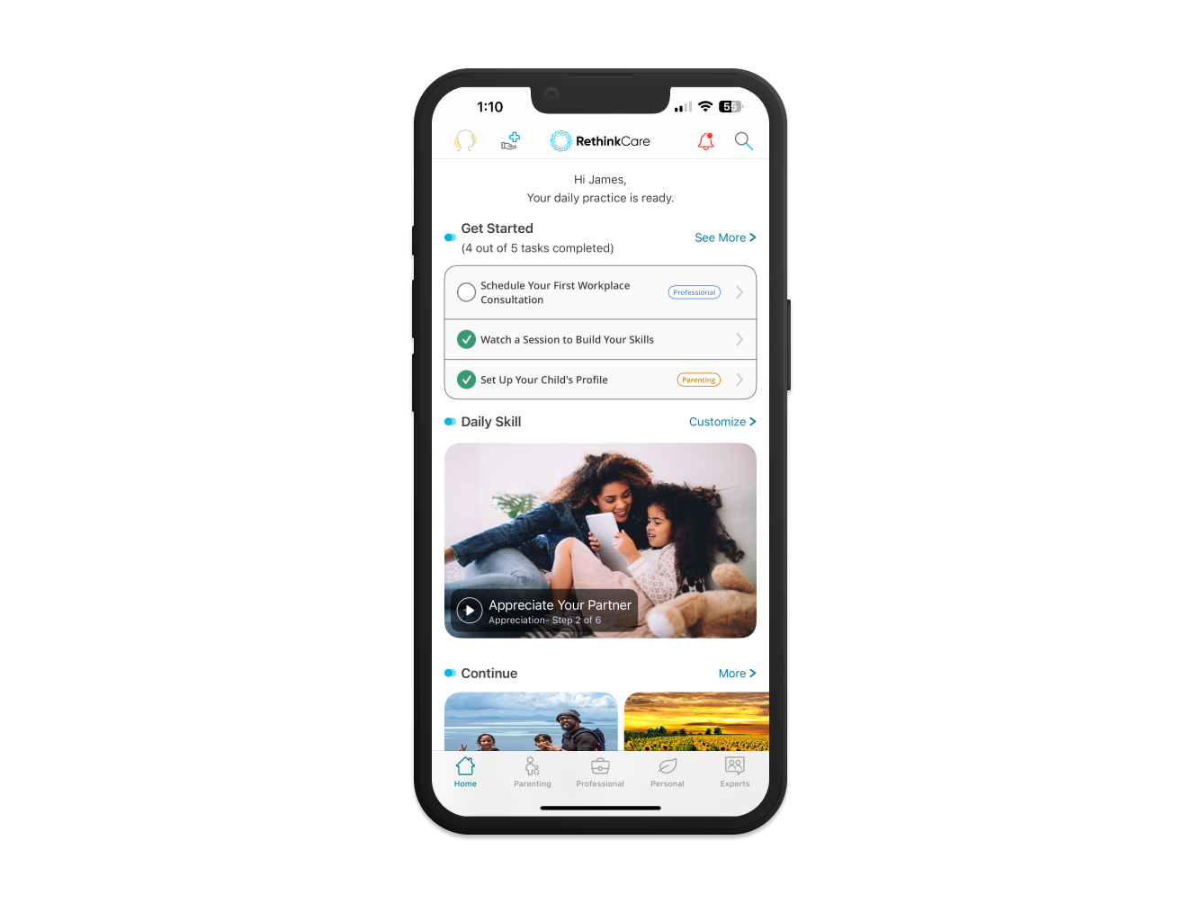
It was determined some kind of to do list was needed on the homepage to help users get started on the platform and get better clarity into the RethinkCare content offerings.
As it existed previously, upon landing on the homepage, the user felt overwhelmed by choices.
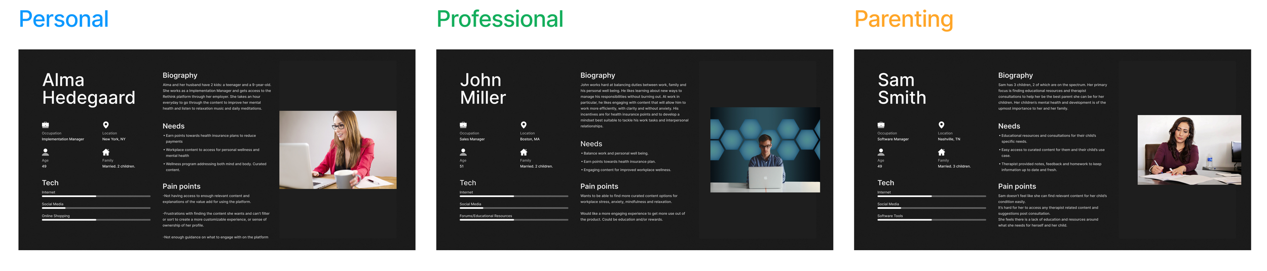
For onboarding, we were informed it would be helpful to break out the content selection for users based on their desired solution (parenting, personal, professional), so that there was more personalization upon entering the platform. We also wanted to improve the UI so that it was more fun and welcoming.
The new designs provide more context into what each solution is and gives the user the ability to customize their experience by selecting content they are most interested in on the platform.
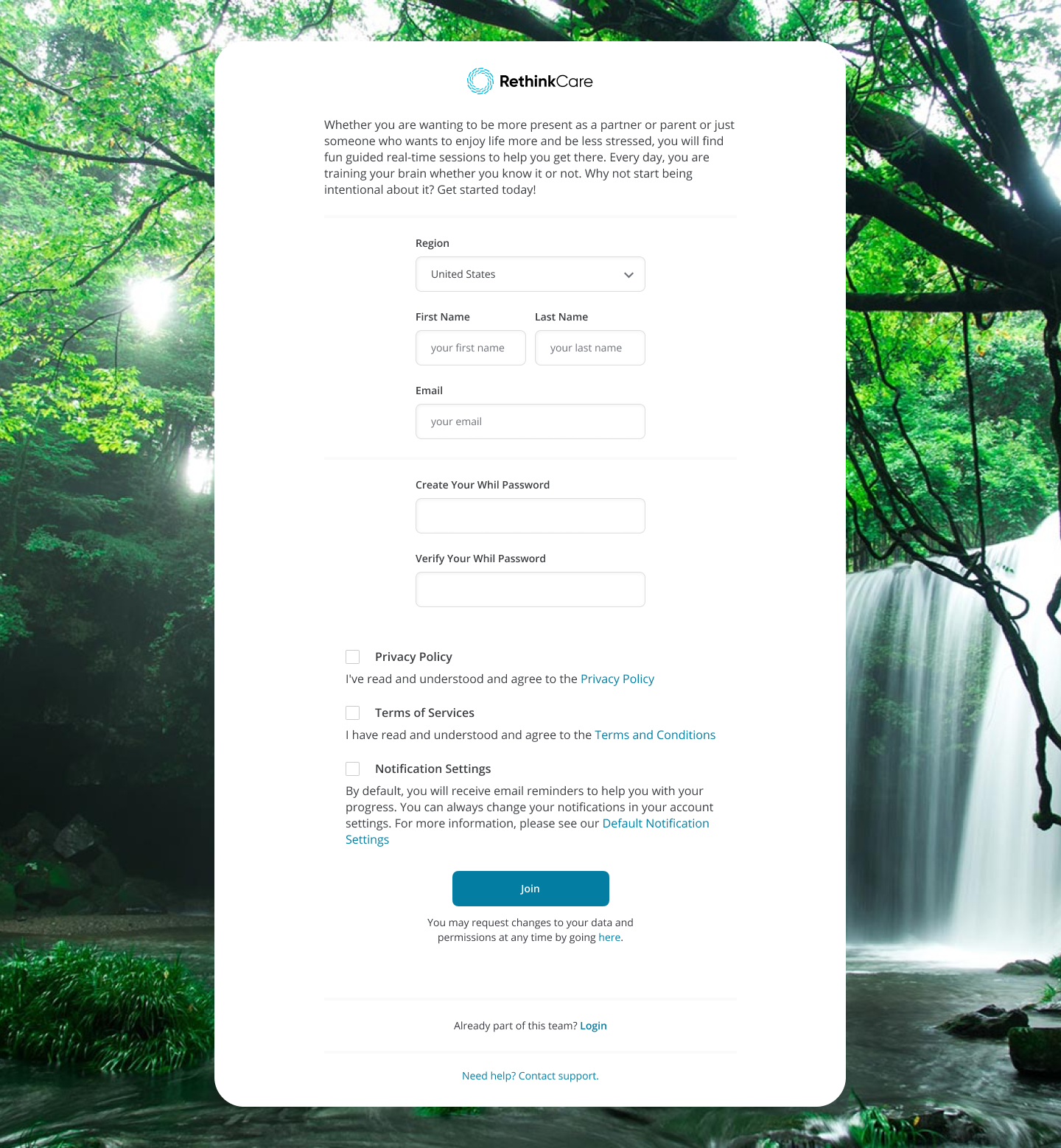
The colors help better distinguish between each solution and the experience becomes more playful with this type of flow. The entire process is only 3 steps, including the initial sign up screen that collects personal information, to keep it easy and not overwhelming.
The major design change was the addition of the Get Started list to help guide the users, the new daily skill video at the top of the page based on selected content in onboarding and the new profile icon in the navigation to help give that new sense of personalization.
These seemingly small changes/features were quite mighty in accomplishing the goal of increasing customization, engagement and user experience of the user’s content library. Making it more personalized and with features that would allow them to interact with the content they truly want to see.
We did A/B tests using a Figma prototype during moderated live sessions. The goal was to gather feedback from the users regarding the task flow of going through onboarding and arriving on their new personalized homepage.
We had 20 people do the testing and 16 voted for flow A. The differences were largely UI aesthetics and layout of the content.
Handoff to developers is facilitated via a product call and the code is accessed right from Figma’s dev mode.
Post deployment, we measured some KPI’s using PowerBI in the form of utilization data on the new get started list and daily skill video. Drop off rates on the onboarding flow and any technical bugs or customer complaints that came into our CS team regarding the new features.
Before the new designs, utilization on the top of page videos was just under 7%, but after 30 days of launch, we saw:
• 18% of daily active users engaging with the Daily Skill Video
• 22% of new users interacting with the Get Started List, with a 12% completion rate
Some design concepts were mocked up for future state iterations. Three tiles to further guide users into engaging with content upon entering the homepage. Movable content blocks to allow the user to customize their own homepage. Also, an easier way to switch profiles between the primary user and any family member with account access.
I also offered the option to add a therapist recommended content lane so a user who opts to see a BCBA professional, has easy access to those videos.
Great project with a positive outcome that actually helped the user’s get more out of the platform and content. Working with Product and the Developers was easy due to the freedom I had to implement my UX process and use the research outcomes to make smart design decisions.
Functional feasibility and requirements were communicated with the team both before and after research was conducted. Research was 2 sprints (1 month) and the designs took about a month to get done with low fidelity wireframes made first followed by multiple iterations then into high fidelity. Usability testing took another week or so.
From the start of the project, which included discovery and research, to completion I would say this took a total of about 2 ½ months. 30 days of KPI monitoring took place after implementation to determine the user engagement increase.