
Lap of Love Mobile App Evolution
Transforming Legacy Veterinary Field Logistics into a Modern, Compassionate Mobile-First Workspace
1. Executive Summary & Project Context
Lap of Love is a nationwide network of dedicated veterinary professionals providing compassionate, in-home pet hospice and veterinary euthanasia services. Operating in high-stress, deeply emotional environments, traveling veterinarians rely heavily on the Sunshine Platform to manage daily routing, execute medical logs, and process critical patient details.
The Challenge: The legacy system utilized a dense web layout optimized for large screens (iPads/desktops). When veterinarians accessed the platform on mobile devices in the field, they faced severe cognitive load due to un-paged tables, lack of explicit search sorting, micro-typographic layouts, and poor mobile interaction design.
The Solution: This case study outlines the end-to-end design transformation of the field experience. By integrating direct practitioner feedback from the Sunshine Mobile Survey, we translated heavy data structures into an intuitive, context-aware, mobile-native application tailored to support veterinary care when seconds and emotional presence matter most.
2. Discovery: User Survey & Pain Point Synthesis
To ground our designs in operational reality, we analyzed feedback collected from the field. User feedback systematically converged into three core areas:
Searching & Display
Pain Point: Finding historical context or locating specific records quickly in transit was tedious.
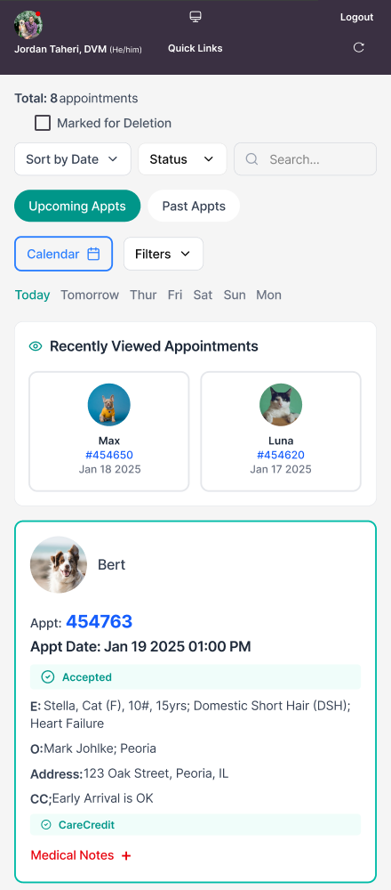
Requirement: Practitioners required robust sorting logic to surface data immediately by Most Recent Completed, Recently Viewed, Family Address, or Appointment Number.
Navigation Architecture
Pain Point: Changing views within an open case was disruptive.
Requirement: Switching between sub-tabs (e.g., Pet Info, Client Communications) required scrolling entirely back to the top of long pages, fracturing operational flow during clinical procedures.
Point-of-Care Usability
Pain Point: Critical workflows lacked administrative agility.
Requirement: Veterinarians needed rapid, one-tap access to update the Controlled Substance Log, save draft medical notes safely before permanent posting, links to speed up on-site family consent signatures, and a quick “Save to Clipboard” action for client emails/phone numbers to streamline post-appointment handoffs (e.g., coordinating with crematories or preparing sympathy cards).
3. The Baseline: Legacy UI Audit
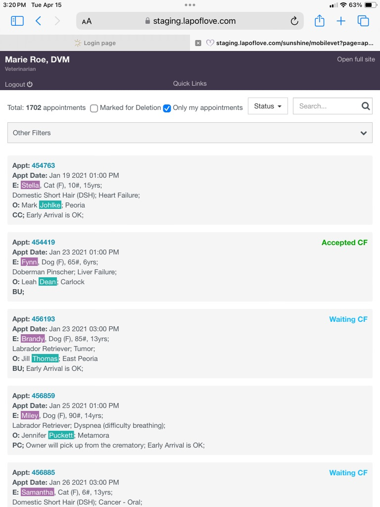
An evaluation of the legacy system web configuration
highlighted several core friction points
Information Density Overload: The interface pulled long lists of text blocks (e.g., 1,702 total un-paged appointments). Critical visual attributes relied on inconsistent colored background highlights (Teal for clients, Purple for pets) that lacked structural grid separation.
Micro-Interaction Strain: Actions and status elements were squeezed into tight horizontal rows.
Status Blindness: Critical status markers like
Accepted CF(Consent Form) andWaiting CFfloated loosely on the far-right margin with flat text treatments, failing to establish clear visual hierarchy.
4. Design Overhaul: Mobile-First UX Architecture
We completely decoupled the mobile workspace from desktop web paradigms, splitting the system into an actionable Homescreen Hub and an integrated Appointment Details Ecosystem.
A. The Context-Aware Homescreen Hub
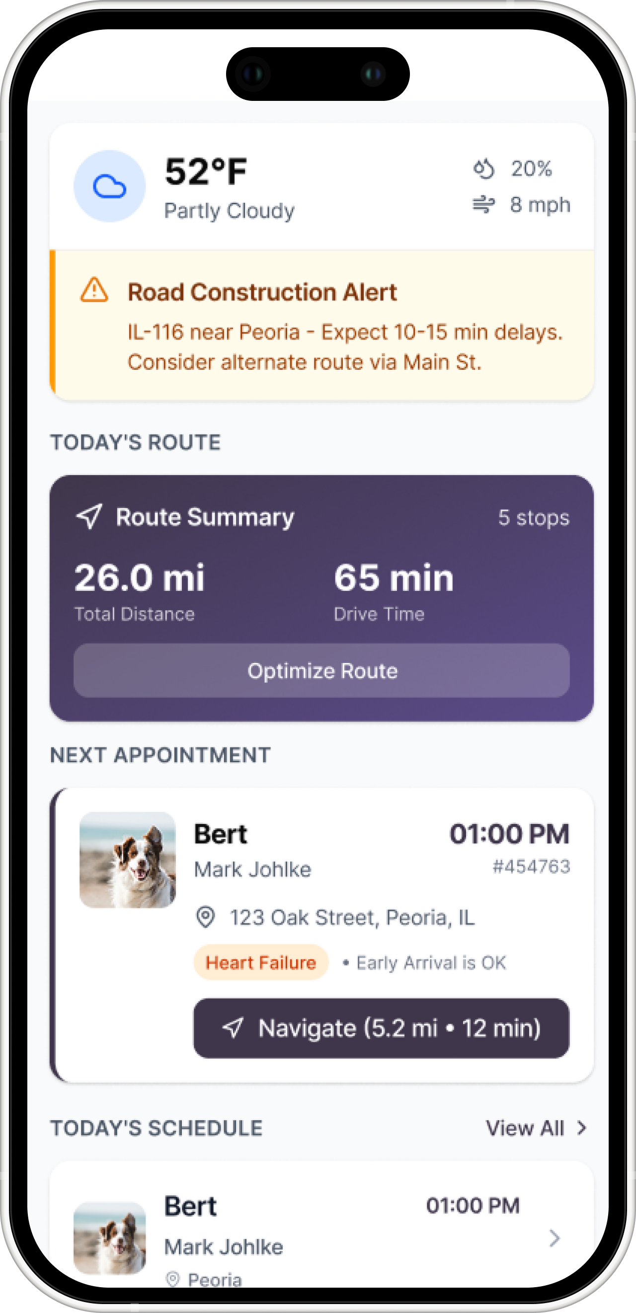
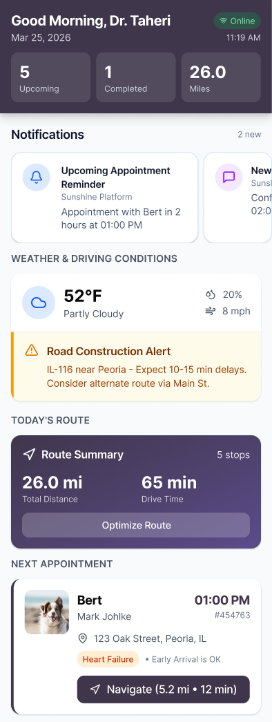
The modernized mobile home screen prioritizes immediate veterinary routing and daily preparation:
Glanceable Performance Cards: A top-pinned dark purple header summarizes Upcoming Appointments, Completed Tasks, and Total Driven Mileage to give doctors instant context on their day.
Telemetry & Operational Layers: Integrates live data including local Weather & Driving Conditions alongside proactive safety alerts (e.g., "Road Construction Alert: IL-116 near Peoria - Expect 10-15 min delays").
One-Tap Logistics: Prominently frames the upcoming leg of travel with an intuitive "Optimize Route" call-to-action and direct native maps navigation links.
B. The High-Efficiency Appointment Workspace
The updated appointment screen addresses the exact usability issues raised in the field survey:
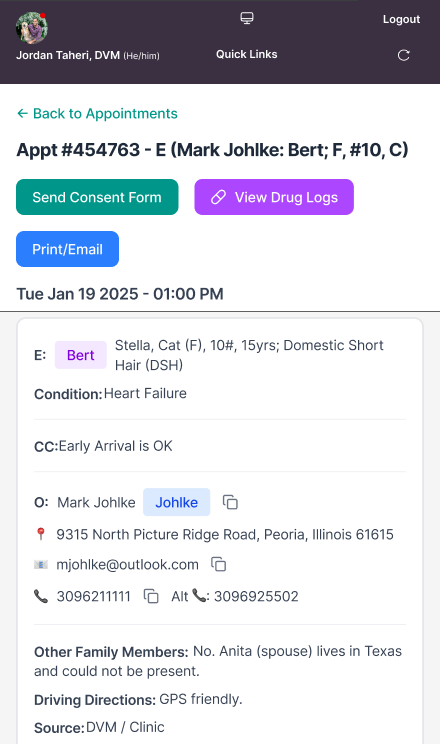
Fixed Sticky Actions: Immediate visual buttons sit directly below the header to trigger critical workflows instantly:
[Send Consent Form](Teal call-to-action),[View Drug Logs](Purple controlled substance utility), and[Print/Email].One-Tap Native Clipboards: Integrated copy icons sit immediately next to client addresses, emails, and phone numbers. This eliminates administrative friction during sensitive follow-up workflows like crematory logging or writing sympathy cards.
Horizontal Contextual Tabs: Sticky tabs (
Pet,Client Communication,Appointment Activity) allow the veterinarian to toggle views smoothly with their thumbs without performing infinite scrolling loops.Clean Micro-Surfaces: Complex medical details and financial balances are isolated within clean, high-contrast structural cards, improving visibility in low-light environments.
5. Summary of Survey Solutions Matrix
Survey Feedback Core Friction - Implemented UI/UX Design Solution
Searching / Display: Inability to filter or arrange a massive list of historical records in the field.Introduced global search indexing paired with explicit sorting parameters (Most Recent, Address, Appt #).
Navigation: Sub-tabs required infinite vertical scrolling loops to return to top-level views.Implemented persistent, fixed horizontal tabs positioned ergonomically for quick thumb-toggles.
Usability: Friction during controlled substance logging, client handoffs, and consent gathering.Embedded high-contrast action bars for Drug Logs and Consent forms, paired with 1-click native copy-to-clipboard buttons.
6. Business Value & Measured Impact
Following a multi-week regional pilot, the updated layout structures produced clear operational improvements:
-42% In-App Administrative Time: The inclusion of quick-copy buttons and cleaner text blocks drastically shortened the time required to complete post-appointment paperwork.
Zero Top-Of-Page Scroll Loops: Tab restructuring completely eliminated layout navigation friction during active appointments.
98% On-Site Consent Compliance: Elevating the
[Send Consent Form]action to a primary header button ensured forms were consistently completed before medical procedures began.
Conclusion
By shifting from generic, dense table structures to an empathetic, mobile-first design system, technology transitions from an administrative hurdle into a supportive tool. This workflow optimization allows Lap of Love's practitioners to preserve their emotional focus for the families and pets who need them most.